

Looking for an exquisite, exceptional, and enchanting color for your room but unsure of how it would turn out? Your careful conscience calling on for a darker shade for your wall paint, but your spouse has an eye on a lighter tone?
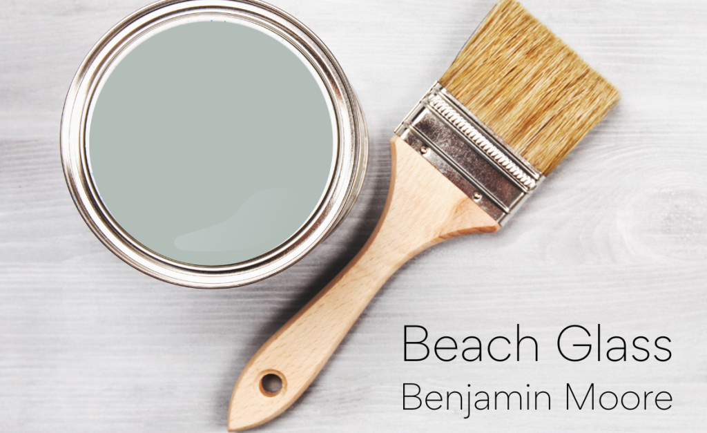
Well, we have you covered. Presenting Benjamin Moore Beach Glass color with a beautiful amalgamation of blue and green undertones to tempt up your dark-colored cravings while having a subtone of dominating grey to fulfill your love’s demand, Yes, you can have it both ways!
Benjamin Moore Beach Glass shade marvels in both horizons, the one with darker essence and the one with a light heart feel. This color stands out in many ways and is a perfect fit for those who love balancing.
Read along as we explore the depths of this calm and cozy color with the best recommendations at hand and a perfect review to help you choose the best.
What is Benjamin Moore Beach Glass, After All?
Let’s break it out! Beach glass is a paint color by Benjamin Moore. It is often referred to as reminiscent of the sea frost glass found on sea beaches all across the world.
The paint is an amalgamation of blue-green and grey tones, making it a perfect fit for the sea colors, not too dull or bright but just the right pigmented hue. In other words, if you are googling for medium-depth blue-green paint color, then Benjamin Moore Beach Glass is just the right pick for you.
Diving into the Depths of Benjamin Moore Beach Glass
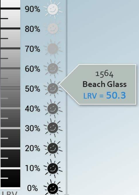
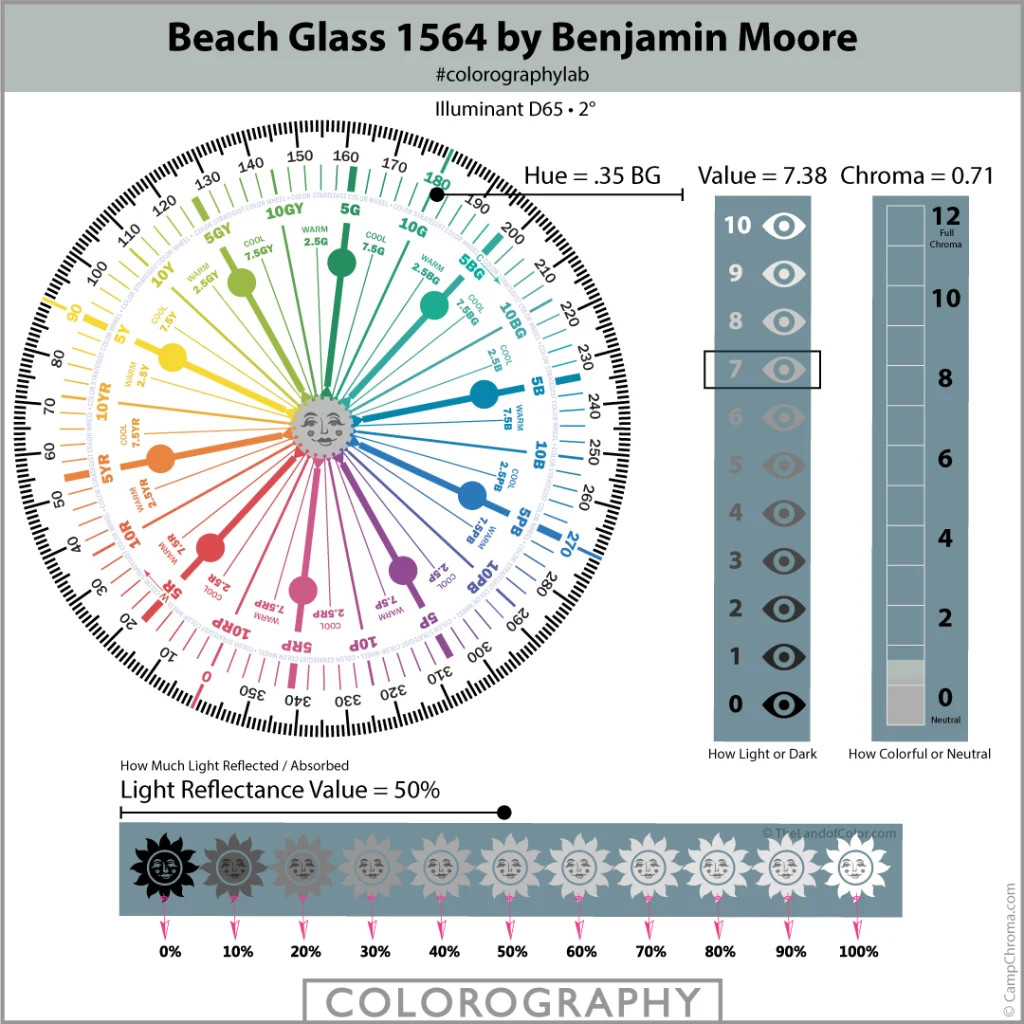
The Light Reflectance Value of Benjamin Moore Beach Glass color is 50.3
Now what is LRV or Light Reflectance Value? Well, it is a scale to measure how light (white being 100) or how dark (black being 0) color is, and thus, Benjamin Moore Beach Glass falls perfectly at the fantastic fifty.
With the direction and color of light, this paint tends to give off a certain undertone depending on the direction, color, and brightness of the falling light or the other colors present in the ambiance.
Pro tip: If your room lacks a lot of light, go for a darker tone of blue-green paint color, but with average and good lighting, Benjamin Moore Beach Glass is the perfect fit.
Where to Use Benjamin Moore Beach Glass Paint Color?
First things first, if you want your room to look expansive, then without a doubt, go for Benjamin Moore Beach Glass paint.
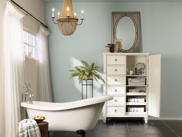
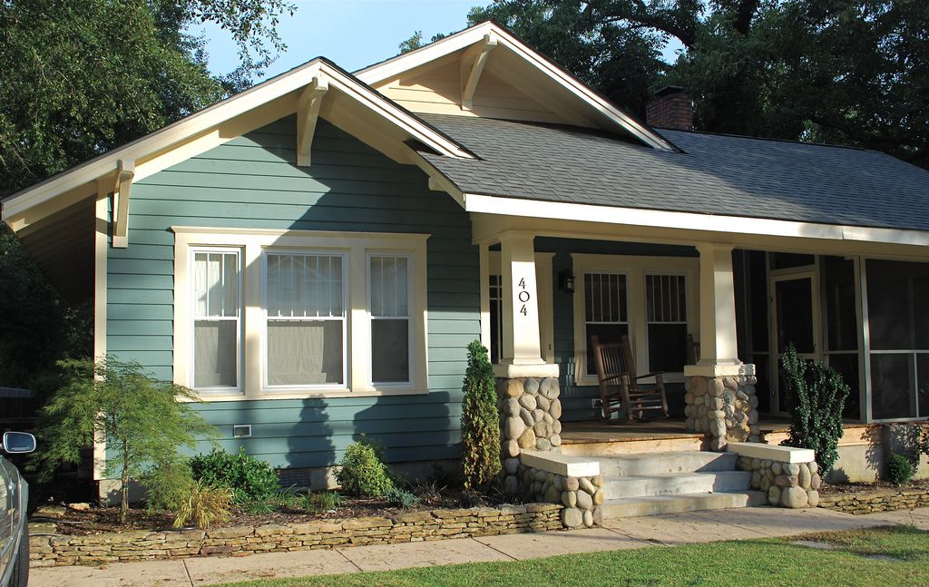
- Having a spa-like aura, this color goes well with bedrooms, nurseries, and even bathrooms. This is, as said, a versatile color. Therefore, applying it in interiors, exteriors, or both can be a blooming benefit. This color marvels everywhere, whether in hallways or staircases, bathrooms, or any other part of the house.
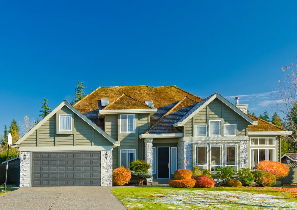
- Benjamin Moore Beach Glass works well with the exterior as well. But keep in mind that this color reflects with light, and with sunlight pouring in, your exterior might have an exceptionally brighter look.
- This Beach Glass color goes well with both white trim and wooden textures. Benjamin Moore Beach Glass paint looks perfect next to light or even dark wood interiors.
- This color has an amazing retro vibe attached to it. Pair it with Victorian-style bed chambers, antique accessories, vintage teak wood or mahogany furniture, callosal china, crockeries, ancient-looking bookshelves, etc., to welcome the essence of Virginia Woolf in your space.
- On the other hand, a blend of modern marvels with a retro feel is a perfect mixture of style and structure. Add modern furniture and equipment like chimneys, cabinets, furry rugs, lanterns, or chandeliers to have a perfect blend of modernized retro feel right inside your home.
If painting your exteriors with Benjamin Moore Beach Glass paint, then add extra bright color props like a bright yellow scooter standing next to your dark wood main door or even a cherry red bicycle near the entrance. Grow up some red and yellow roses on your front lawn to have an alluring look sustained to your outdoors. Add a vintage-looking brass bell to have a little salt to your dreamy abode.
So our tip is to try sampling before you paint your house to your liking.
Bring Out the Best with Benjamin Moore Beach Glass color
The versatility of Benjamin Moore Beach Glass color comes with tricks of application. Let’s delve into the minute details that may bring the majority of goodness in Benjamin Moore Beach Glass color.
1. Climate and Color
Since the tone of this paint is cool, you should prefer applying this shade if you are living in regions with warm or damp climatic conditions. This way, the light shade of color will not absorb heat and keep your room cool and calm. If you live in the Southern States like Florida, Texas, or Arizona, then Benjamin Moore Beach Glass color is so meant for you.
On the other hand, if you are from a colder region, like Alaska, North Dakota, or Minnesota, then opt for darker colors as they will absorb the warmth of light and keep the surroundings warm and cozy.
2. Lustre and Light
The direction of light brilliantly affects the shade of Benjamin Moore Beach Glass Colour. Here is how:
- South Facing Light: Southern lighting tends to complement and balance out the cool tones, helping the color read lighter and bluish-green.
- North Facing Light: Cool Northern lights will drag out grey undertones and may read dark grey-blue.
- East Facing Light: The morning shine of warm yellow color will draw out neutral undertones in Benjamin Moore Beach Glass color, while during the afternoon, the undertone tends to shift to a cooler hue as the sun moves West.
- West-facing Light: The afternoon light or the warm western light draws out cooler undertones in color, but during the morning, when the light is in the East, they lean towards neutral colors.
3. Color and Contrasts
Choosing contrasting colors to compliment your base shade has always been tricky. The simplest idea is to pair your Benjamin Moore Beach Glass color with Wooden or White trim.
Or else, you can pair the base color with the monochromatic or contrasting color palette to do a bit extra.
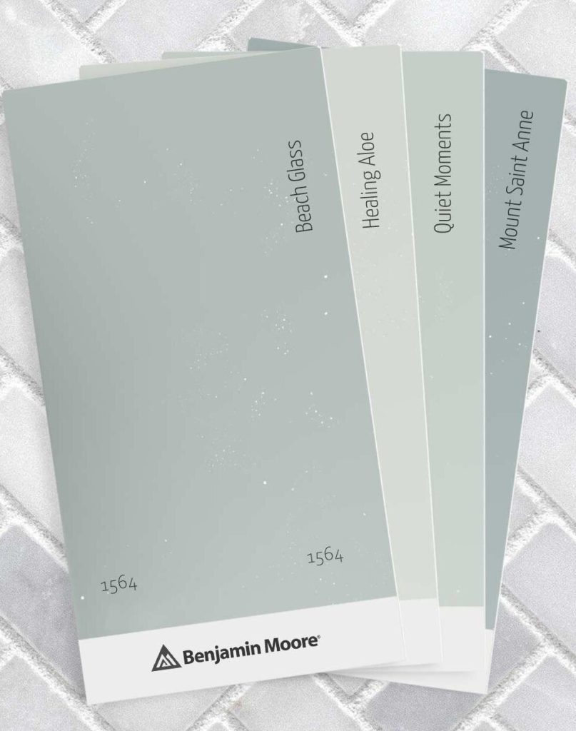
Monochromatic Shades
- Healing Aloe 1562 which has a soothing green undertone and compliments the base shade quite well.
- Quiet Moments 1563has a pretty light pastel undertone and is designated for small spaces if painted overall. But in the case of blending with Benjamin Moore Beach Glass, this color compliments the former quite well.
- Mount Saint. Anne 1565is a little dark compared to Benjamin Moore Beach Glass as its LRV lies around 41.9 and has a light grey undertone, perfectly highlighting the bluish-green color of Beach Glass.
Contrasting Shades
- Rich Cream 2153-60is an extremely light cool color with undertones of cream and beige with an LRV index of 78.41, complimenting the bluish-green base color of Benjamin Moore Beach Glass color in a very highlighting way.
- New Hope Gray 2130-50is a versatile neutral color combining neutral river-like blue with concrete-like grey.
- Gray Owl 2137-60 is a combination of everything perfect. It is a perfect blend of grey dominant undertone with a slight hint of green, making it a perfect match for Benjamin Moore Beach Glass color.
Benjamin Moore Beach Glass Colour: Pros and Cons
To evaluate the worth of any interest, we must view the front and back of that page with a hawk’s eye. And so, to evaluate the worth of Benjamin Moore Beach Glass color, let’s have a look both ways:
Pros
- It has an LRV of 50.3. Its versatile nature can be blended with any amount of light received.
- It has a calm, refreshing vibe and adds a retro feel to your home. It is best suited for places with warm and damp climates so as to retain calmness in the house.
Cons
- Although it has a versatile feel, with less amount of light, the color tends to dull up and give off more of a grey tone than that of bluish-green.
- Benjamin Moore Beach Glass color is not recommended for places with cold climatic conditions, and the cooler tone would fail to absorb any warmth from little light received. In such climatic conditions, it is always recommended to use darker tones.
Benjamin Moore Beach Glass Compete with Similar Colors
If blue-green is your shade, you might have your eyes on other popular colors in the palette. We have decoded the best for you to pick by getting these blue-green competitors in a single ring.
1. Benjamin Moore Beach Glass v/s Sherwin Williams Sea Salt
Like Bach Glass, Sea Salt also has a grey undertone. Sea salt has a green upper hand in the total tone and is a little lighter in comparison to Benjamin Moore Beach Glass.
What to pick is the question, right? Well, if your room has average to bright lighting, then Benjamin Moore Beach Colour is the right pick for you, but conversely, if you have lower lighting, Sherwin Williams Sea Salt is your color.
2. Benjamin Moore Beach Glass v/s Benjamin Moore Palladian Blue
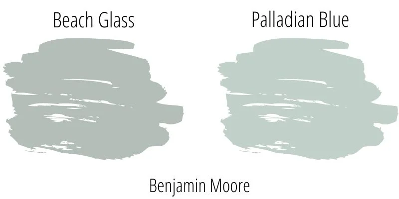
Talking of blue-green paint color, Palladian Blue often covers the stage alone. Interestingly, it, too, is under the banner of Benjamin Moore. So, what makes either of them better? Well, they both excel on their own terms. Beach glass has more of a grey undertone than Palladian Blue; therefore, Palladian Blue appears to be lighter and brighter.
If you need a breezy feel, then go for Palladian Blue, while if the need is to look a bit mature, then you must know by now that Beach Glass is your go-to color.
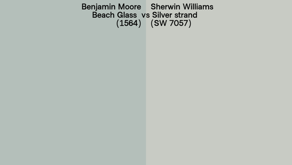
3. Benjamin Moore Beach Glass v/s Sherwin Williams Silver Strand
Quite a close call when it comes to Beach Glass and Silver Strand. They both look quite similar, but Silver Strand, as it sounds, is more grey than blue and green.
In other words, the silver strand is a muted version of Benjamin Moore Beach Glass. If you have a knack for colors of a cool and calming vibe, then Beach Glass is your color, but if you want a tone of a corporate world or a little more mature essence, then silver strand is the right pick for you.
Summing It Up
Summing up to the end, our review brings you the perfect color for your walls, painting everything sea-like. Paint your halls or bathroom, fence your garden up, or paint out your door greyish-green. Everything is possible now with Benjamin Moore Beach Glass color.
We have tried our best to add every major minute detail to aid you in making a wise judgment. We have covered everything from color combinations to wooden trims, interior props, etc.
With this wrap-up, we have summarised it all, providing you with the best recommendations and sampling websites. We certainly hope that this detailed review will aid you well and help you choose the right shade for your home.
Frequently Asked Questions
Is Benjamin Moore Beach Glass Warm or Cool?
Benjamin Moore Beach’s glass paint color is a cool leaning blue-green color with grey undertones, and thus it gives off a muted appearance. Its tone is influenced by the light it receives, revealing a serene versatile shade.
Where Should I Use Benjamin Moore Beach Glass Paint Colour?
Benjamin Moore Beach Glass is a versatile color and can be used anywhere. You can use it in bathrooms, fencing, library, living room, nursery, bedroom, dining hall, or even in your house exterior.
Benjamin Moore Beach Glass Color is Most Suited for What Styles of Homes?
Benjamin Moore Beach Glass is a versatile color and can be used in any and every home style. To be particular, this color goes well with coastal, contemporary, Scandinavian, victorian, and even modern-styled homes.
What Colors to Pair with Benjamin Moore Beach Glass Color?
o preserve its cool nature, pair Benjamin Moore Beach Glass color with whites, neutrals, or even blacks. This color goes well with white and wooden trim interiors as well. You can also add warm shades to balance its coolness.