
Green paint demand is rising continuously because of the calm and soothing effect it brings inside the home. If you are thinking of painting all walls of your room gray or green and incorporating the green-gray paint vibes inside your home, the last thing you want is to end up messing things up in your home.
Is green-gray paint worth trying inside the home? Yes, it is worth trying if you pair the most suitable shade according to the room or interior size and the light effect in your home.
Keep reading to learn more about the green-gray paint colors. In this post, we have covered 30 green-gray paint colors for your home to help you select the most suitable shade for your home interior.
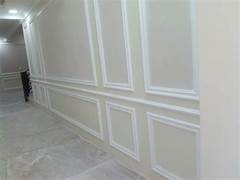
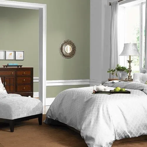
1. Light Gray Green
Who doesn’t love light shades that help you to avoid feeling overwhelmed? And so, the importance of light color shades in paint makes the light gray-green worthy enough to pick and try in your home. For instance, here is a view of the dining room where the green-gray paint on the wall with a slight vertical pattern makes it so calming.
The white paint on open shelves, cabinets, and window frames looks adorable. The neutral hue of the floor makes the dining room stunning. The chairs add shiny vibes to the lighter dining room. The old table with incomplete paint finishing touch still looks great. The dining room is perfectly balanced with light gray-green and neutral hues.
2. Healing Aloe Green Gray Paint
The most soothing green-gray paint color shade is healing aloe. This subtle green-gray paint shade is close enough to the white paint shades. This color reflects the softness of green without emanating the vibes of mint shades.
The Light Reflective Value of healing aloe green gray paint is close to 70, which is precisely 69.66, which makes it light, soft, and shiny enough to enter into the warm color tones of green-gray paint colors. This color goes well in the guest, sitting, and relaxing rooms. You can perfectly pair it with white and brown furniture.
3. Muted Mint
Consider muted mint the priority if you are looking for natural vibes with the classic celadon touch. This color has the power to complement almost every other color shade. So you don’t have to change the other colors, like bed covers, furniture color, floor and ceiling, or rugs.
If you want to make it bold in your interior, use it in the majority. You can also pair it perfectly with black and white shelves, floor tiles or backsplash, and countertops in the kitchen or bathroom. Neutral hues in brown or tan also go well without creating great contrast or saturation in the interior.
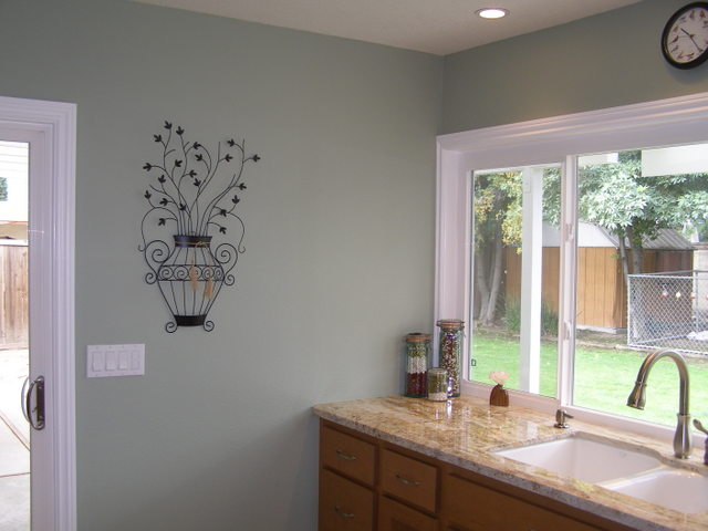
4. Sea Salt Green Gray Paint
If you are looking for a paint color you can use in your complete home or building interior, Green Gray Paint is the best color to consider. This shade of gray-green paint is super soft and subtle enough to use anywhere you want without an overwhelming effect.
Sea green acts like a neutral tone, so it perfectly goes well with the white and wood accents. For instance, the interior has sea green paint on the whole room and all walls, including the ceilings. Yet the room doesn’t seem to create an overwhelming effect. The brown floor bedroom furniture and beams in the ceiling add a dramatic touch to the overall look.
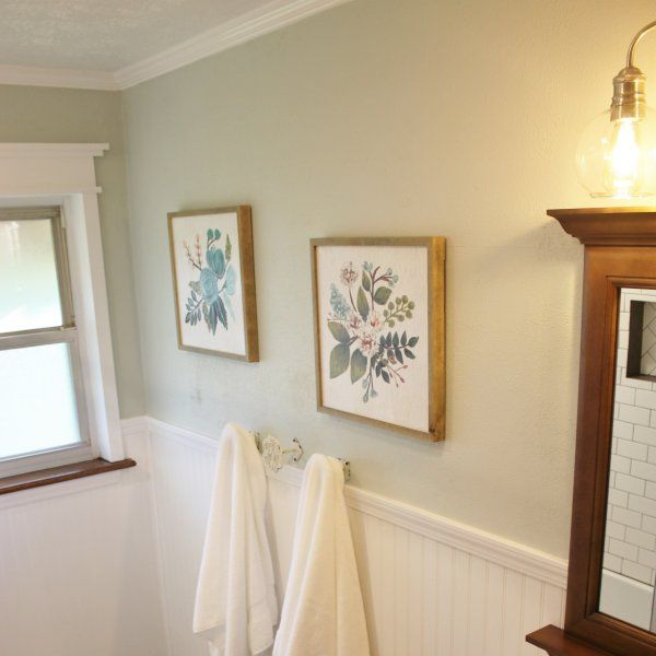
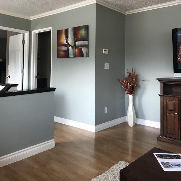
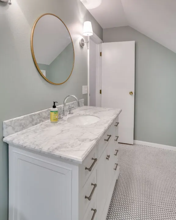
5. Silver Crest Green Gray Paint
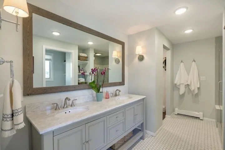
The silver crest green gray paint is worth trying if you are looking for a green paint color that gives the blue color shades while balancing its green nature. This paint is a lighter shade of green color, with a touch of gray color, and has some of a hint of blue hue. The Light Reflective Value of the silver crest is 71, which makes the paint brighter, as it reflects the light to a greater extent while the absorption ratio is very low.
The white linen and gray vanity balance each other and create a relaxing look in the interior environment. Silver crest will bring spa-like vibes and feel to your washroom or relaxing room, making it perfect for such rooms.
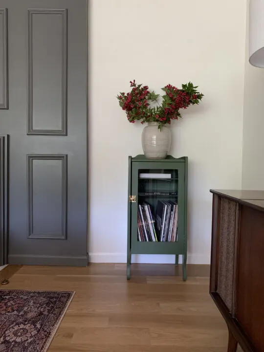
6. Granite Dust Green Gray Paint
Granite dust has the lovely distinctive feature of gray shades. Granite dust has gained popularity with many brands and for many things, so be careful while selecting the Granite Dust Green Gray Paint color. We are discussing the Valspar Granite Dust, popularly used in the home interior.
The Light Reflective Value of Valsper granite dust paint color is 48.11, making it absorbent to store the light and reflective enough on the string light. This color works well on larger sections like walls, pattern walls, closets, or long cupboards.
7. Douglas Fir Bright Green
The bright shade and shine of the green are visible in the Douglas Fir with the naked eye. This paint is a strong green shade with vibrant yellow undertones, like the beach green.
This bright green color creates optimistic vibes in the interior, making it a perfect fit for party Vibes, zones, or serious nooks like study corners.
The motive for using this color in serious zones like study rooms is to remain positive in stressful situations. The bright green gives you hope for your future and the outside world. You can pair this shade with white, blue, or pink for better compliment tones.
8. Gypsum Green Gray Paint
This warm shade of green-gray paint is much closer to the off-white paint because of the closer enough Light Reflective Value. Gypsum has an LRV of 82, making it bright enough, but it is not popular as off-white, so it becomes underused paint as people prefer off-white. Gypsum paint is a subtle shade of white with a hint of gray and green.
So the Gypsum Green Gray Paint is the warmer tone which is enough neutral and complicated White. This color goes well with black to create a contrast and dramatic look. And it is well balanced by the brown or earthy tones.
9. Sherwin Williams Oakmoss
This gray-green shade in Sherwin Williams Oakmoss is worth considering if you want a muted green color. This color is a green-yellow shade combination. This shade of Green has a Light Reflective Value of 13, which makes it a muted tone to bring a dramatic touch to the home or interior of any particular building.
These gray-green shades go well against the neutral hues and walls, creating rich accent vibes. You can use it in the living room or guest room or even paint your home’s furniture, like doors, cupboards, coffee tables, dining tables, etc., to add a rich touch.
10. Retreat Green Gray Paint
The retreat is a shade of Sherwin Williams collection paint and gives the vibes of smoky green that perfectly balances the mixture of green-gray paint in its name. The retreat green-gray paint shade is delightful, emanating the vibes of the forest view you are gazing through the campfire smoke.
You can paint the cabinets, cupboards, shelves, and doors with the Retreat Green Gray Paint without a second thought. This interior view has enough retreat green-gray paint in the cabinets and the storage zones. The retreat paint is balanced with the gray paint on the ceiling, the white paint, and the brown floor.
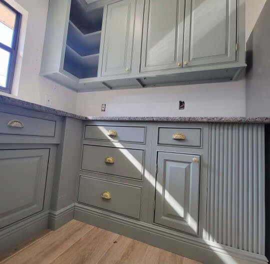
11. Calke Grass Green
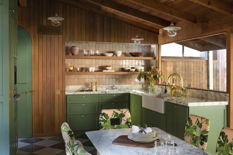
If you want to bring midcentury vibes to your home, Grass Green is a good option apart from Tricorn Black paint shades. This color will give the vibes of a grounded, humble and down-to-earth overview. For instance, this Kitchen interior view taken by Jess Isaac gives such a great midcentury feeling.
The backsplash is made of marble, and the chessboard pattern of black and white floor balances each other with contrast. The brass accent against the grass green cabinets of the Kitchen and the counterparts’ top adds a new lively look. The green grass on the chair cover also brings a small touch of creativity to the Kitchen.
12. Saybrook Sage Green Gray Paint
Saybrook is a good shade of green-gray paint color that emanates good vibes. The Benjamin Moore Saybrook Sage green-gray paint is hard to describe because of many things. The color shade emanates smooth vibes. More than the interiors, Saybrook Sage Green Gray Paint color is used on the exterior.
The Light Reflective Value of 44.86 makes this color shade smooth enough, and it goes well with white light or color incorporation like in the doors, window frames, art frames, etc. You can pair it well with gray, brown, blue, and natural green tones.
13. The Evergreen Fog
The shade Evergreen Fog was the color of the year by Sherwin Williams in 2022. This green shade’s thirty-Light Reflective Value makes it a lighter, fainter, neutral hue that doesn’t shine much.
Sherwin Williams Evergreen Fog has a yellow color with gray tones that make the evergreen fog distinctive in changing hues and shades depending on the light and sunlight falling on the room wall. If your home interior has a cottage architecture style, evergreen fog will perfectly go well with it. This color is perfect for a relaxing room, storage room, or Kitchen.
14. Sea Sage Green Gray Paint
Pick up the Sea Sage shade for a more popular green-gray paint color. The light reflective value of the Sea sage color is 31, which makes it cool enough. The sea sage green-gray paint color brings muted vibes and adds an aqua feel to the room. You can paint your room walls with the Sea Sage green-gray paint color without a second thought.
The sea sage green-gray paint color goes well with darker and lighter shades like black and white. White floor and ceiling will make the Sea sage green-gray paint on the room’s walls smoother. The black incorporation in door and window frames will bring bold touch and balance the overall room.
15. Bavarian Forest
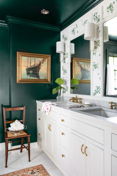
This deep shade of green color is enough to give you the vibes of a dark green forest area or zone. The color shade is elegant and bold, creating a beautiful and natural look and vibes in the surroundings and wherever you apply the paint. Bavarian Forest can easily add depth to your room, giving the vibes and illusion of a large room, especially when you paint it in the smaller room walls.
This color shade had the emerald vintage touch that emanates the dark jewel shine vibes. For instance, this dark green Kitchen wall and interior, by Janet Mesic Mackie, looks bold and elegant. The kitchen’s overall look is balanced with the white cabinets and countertops, making the room lighter.
16. Pewter Green
The Pewter Paint is a dark green shade that is not dark enough and lies somewhere in the middle of dark tones with enough warm touch while maintaining the metallic cool tones. This color shade lies between the dark sage and dark gray tones and poses the metallic quality, so it can easily create an illusion that the things are made of metal instead of wood or bricks.
Pewter green is a neutral shade as it has enough cool undertones that make it metallic and has olive and yellow undertones to make it warmer. The Light Reflective Value of Pewter green-gray paint is 12, making it a darker shade and a perfect fit for creating depth in the interior.
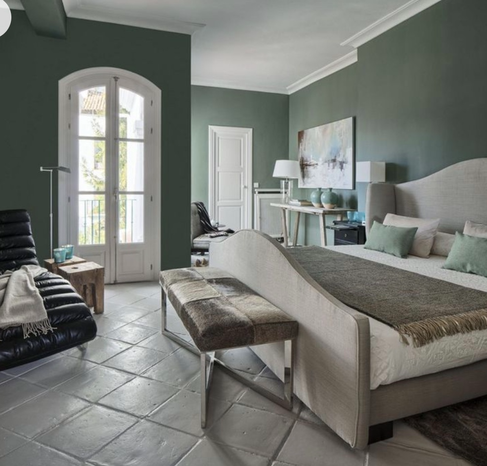
17. Olive Sprig Green Gray Paint
The perfect shade that brings the outdoor surrounding vibes inside the home has the name Olive Sprig. This gray-green shade has earth tones, making it more calming and versatile. The Light Reflective Value of 42 allows the olive sprig to add enough depth wherever you paint it, like on the walls or door.
The calming and soothing vibes reflect the reborn and regrowth touch in the room, which makes it a perfect fit for the living room, relaxing room, or even your bedroom. For instance, this bedroom view via PPG is perfectly balanced with the olive sprig paint walls, white and gray curtains and bedcovers, and the brown floor.
18. Jasper Stone Green Gray Paint
Sherwin Williams Jasper Stone is rich in the undertones of blue shades in the complete collection of gray-green shades. Depending on the light falling in the room, the look of jasper Stone green-gray paint changes completely. This green-gray paint is a fainter shade of Aqua color. In the cool light, it looks shiny, while in the artificial warm light, the Jasper Stone gets darker visibility.
This color is close enough to Acacia Haze when it is about changing color under the light effects, and both have the same Light Reflective Value of 32. For instance, here is the kitchen interior view in the Jasper Stone green-gray paint cabinets and cupboards,
19. Hague Blue
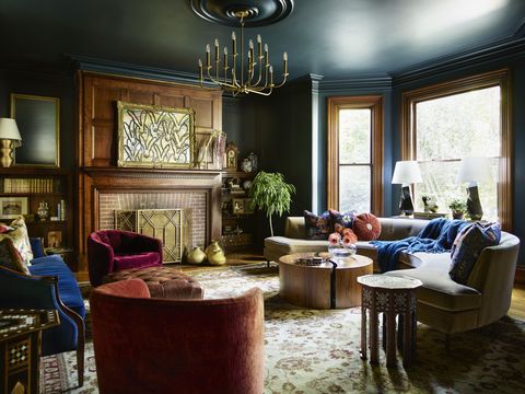
Farrow and Ball Hague Blue is a darker shade of green that emanates the vibes of calming effect under the big darker tree offering calming and cool shade when you lay down under it to relax. So this shade is a perfect choice if you are contemplating painting your bedroom or relaxing room. The Hague blue shade will create an intriguing touch and vibe in your room, creating drama and depth effects.
You can perfectly pair or balance this color by adding a lot of wood accent or brown color to your interior. For instance, wooden furniture, headboards, wood art wall, and window frames in this interior view captured by Jared Kuzia look so stunning with the Hague Blue paint on the wall.
20. Rock Bottom Green Gray Paint
If you are looking for a fainter shade of black color, then pick up the Rock Bottom green-gray paint. This shade is the darkest from the green-gray paint collection and prevents your room from getting too dark by its light shade effect than the actual black paint. Rock Bottom Green Gray Paint is a neutral tone that contrasts nicely with the white color.
The Light Reflective Value of Seven makes it black enough to absorb much light and faint enough not to look completely dark. For instance, This view has enough Rock bottom green-gray paint on cabinets and cupboards. The overall Kitchen is well balanced with green surroundings and wood accent incorporation.
21. Oyster Bay Green Gray Paint
This green-gray paint is the prettier shade with earthy touch vibes. The Light Reflective Value of forty-four allows Oyster Bay to emanate a depth look and vibes in the room. This green shade is perfect for small rooms or zones where you want to add a touch of Oomph.
For instance, here is the bathroom view via a green bathroom makeover that looks so fresh and classy and easily inspires someone to steal a similar theme and shade to try in their home bathroom. The oyster bay paint goes well with other shades of gray paint too. The white color of the lights perfectly balances the overall view.
22. Acacia Haze Green Gray Paint
Acacia Haze color is popular for changing the shades and visibility under the light effect, creating the impression of warm and cool tones depending on the light. This shade of green-gray paint is delicious in vibes and visibility with its cool tone. The Light Reflective Value of 32 makes Acacia Haze close enough to Jasper Stone, but that color has more undertones of Blue color shade.
This shade of green-gray paint is lighter than Retreat Gray Green and Darker than the Oyster Bay green-gray paint. The shade changes its color visibility under different lights.
23. Kelly Green
Consider Kelly Green paint or shade if you are looking for bold designs and accents with calming and soothing gray-green shades. This green color brings new life to the room by adding a vibrant touch. The Kelly Green has a saturated shade so that you can pair it up with narrow hall or wall designs.
For instance, in this interior view taken by Gail Davis Design, the Kelly Green and white design on the stairs gain attraction and looks so pleasing to the eyes, leaving a nice impression. So Kelly Green paint can create a vibrant impact in important areas like art spaces or hallways. The Kelly Green color matches the fray, red, black, blue, and wood tones.
24. Milestone Green Gray Paint
The most stunning quality of MIlestone gray is its feature of changing color with the light change in light. Benjamin Moore Milestone Green Gray Paint color has a Light Reflective Value of 15.3, slightly darker than many other green-gray paint colors. Milestone green-gray paint sits well on the Cabinets, like in the Kitchen or washroom.
This color goes well with the white walls and brown floor or rug. To bring the best out of this color, use it in the Kitchen that allows enough sunlight entrance and sufficient artificial light in the interior.
25. Svelte Sage Green Gray Paint
If you are looking for a warmer shade of Green that doesn’t make your room overly bright, pick up the Sherwin Williams Svelte Sage paint. This shade is a medium tone of light yellow color, with undertones of Gray.
The Light Reflective Value of Sherwin Williams Svelte Sage Gray Green color is 41, which doesn’t reflect much light, so it easily dulls the yellow color and controls the bright tones. The muddy Green Gray Paint adds a perfect touch of warmth to the room that is enhanced when the sunlight enters the room.
26. Marine Green
This is a deep-tone green-blue color that can create a cocooned interior. This color shade lies between navy and teal color shades. Being darker adds a dramatic touch to your interior or wherever you apply it. Marine Green goes well with the wood accent and earthy tones and is the perfect choice to paint small nooks or rooms.
For instance, this smaller space view is perfectly balanced with the Marine green walls, wood wall closet, white boundaries, and silver mirror and accents on the table, and the gray rug on the floor all add a great dramatic touch.
27. Light Moss Green Gray Paint
This gray-green shade gives the vibes of a pale green blend creating the ombre effect on the walls. This color emanates the sense of extended indoors to the outdoor surrounding by bringing those outdoor vibes inside the doors and windows. The best thing about this color is that you can create the illusion of a bigger room if you paint the smaller zones or rooms with a Light moss color shade.
This color is going to light and elevate your spirit. You can easily pair light moss color shade with Moroccan clay tiles or backsplash, Wood accent or brown furniture, or floor. White countertops bring the shiny blend making it more shiny and natural.
28. Heritage Park Green Gray Paint
If you are looking for cozy vibes in your room with a touch of green color, consider the Heritage Park Green Gray Paint color. The Light Reflective Value of Heritage Park’s green-gray paint color is 17, which makes it light absorbent, so it doesn’t shine much and falls slighter in the cool tones of gray-green paint color shades.
You can paint the room wall, doors, and cabinets, or even bring creativity touch by incorporating Heritage Park paint or shades in your room as wallpaper or curtains. This color goes well with gray in the form of bedcovers or furniture covers and floors.
29. Muted Sage Green Gray Paint
Muted sage is a shade of Behr with more undertones of yellow; still, it falls in the green-gray paint category. Muted Sage color is the warm tone of Green Gray Paint. You can paint the interior walls with this color if you want to feel the muted and sage vibes in the room.
The Light Reflective Value of Muted sage green-gray paint color is 28. This paint shade goes well with the gray and sand color hues. You can also make the room or interior shiny with white color in the form of door and window frames.
30. Black Locust
This gray-green paint has a shade-changing feature like the Chameleon. So depending on the light entering the room or the artificial light falling on the walls or Black Locust, this paint changes color. The light reflective value of the Black Locust is 13, which helps it to change its color depending on the absorption of light under different conditions.
This color looks fairly green in the natural sunlight; meanwhile, it emanates the properties of charcoal color under artificial light. You can feel the fairly green and charcoal mid-tone in this Black Locust green-gray paint in the balanced artificial and natural light. This color goes well with the white and brown accents.
Final Thoughts
Everybody wants to keep their home vibes like the natural surroundings as much as possible by maintaining aesthetics and creativity. That’s why green paint shades are popular, and green-gray paint help to achieve the target by eliminating the overwhelming effect of green. Choosing the suitable green-gray paint shade according to your requirement, interior zone, room size, vibes you want, and the surrounding color themes is the right way to get there.
This post showed you 30 green-gray paint colors for your home that can easily transform the whole look and bring natural outdoor vibes inside the room. We have covered from light green-gray paint shades to muted green, silver crest, bright green, and much more to help you select from cool and warmer tones, light and darker tones, according to your home interior architecture styles.